HTML5/CSS3/4. CSS3로 웹 페이지 꾸미기
Day 43 : 시각적 효과
pancakemaker
2021. 12. 16. 12:46
1. 텍스트 그림자 : text-shadow
text-shadow : h-shadow v-shadow blur-radius color|none

- h-shadow, v-shadow : 원본 텍스트와 그림자 텍스트 사이의 수평/수직 거리(필수)
- blur-radius : 흐릿한 그림자를 만드는 효과로 흐릿하게 번지는 길이(선택)
- color : 그림자 색
- none : 그림자 효과 없음
<!DOCTYPE html>
<html lang="en">
<head>
	<meta charset="UTF-8">
	<meta name="viewport" content="width=device-width, initial-scale=1.0">
	<title>텍스트 그림자</title>
	<style type="text/css">
			div {
				font: normal;
			}
			.dropText {
				text-shadow: 3px 3px;
			}
			.redText {
				text-shadow: 3px 3px red;
			}
			.blurText {
				text-shadow: 3px 3px 5px skyblue;
			}
			.glowEffect {
				text-shadow: 0px 0px 3px red;
			}
			.wordArtEffect {
				color: white;
				text-shadow: 0px 0px 3px darkblue;
			}
			.threeDEffect {
				color: white;
				text-shadow: 2px 2px 4px black;
			}
			.multiEffect {
				color: yellow;
				text-shadow: 2px 2px 2px black,
							0 0 25px blue, 0 0 5px darkblue;
			}
	</style>
</head>
<body>
	<h3>텍스트 그림자 만들기</h3>
	<hr>
	<div class="dropText">Drop Shadow</div>
	<div class="redText">Color Shadow</div>
	<div class="blurText">Blur Shadow</div>
	<div class="glowEffect">Glow Effect</div>
	<div class="wordArtEffect">WordArt Effect</div>
	<div class="threeDEffect">3D Effect</div>
	<div class="multiEffect">Multiple Shadow Effect</div>
</body>
</html>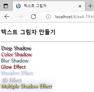
2. 박스 그림자 : box-shadow
box-shadow : h-shadow v-shadow blur-radius spread-radius color|none|inset

- spread-radius : 그림자 크기 (선택사항, 디폴트 0)
- inset : 음각 박스로 보이게 박스 상단 안쪽(왼쪽과 위쪽)에 그림자 형성
<!DOCTYPE html>
<html lang="en">
<head>
	<meta charset="UTF-8">
	<meta name="viewport" content="width=device-width, initial-scale=1.0">
	<title>div 박스에 그림자 만들기</title>
	<style type="text/css">
		.redBox {
			box-shadow: 10px 10px red;
		}
		.blurBox {
			box-shadow: 10px 10px 5px skyblue;
		}
		.multiEffect {
			box-shadow: 2px 2px 2px black,
						0 0 25px blue,
						0 0 5px darkblue;
		}
		div {
			width: 150px;
			height: 70px;
			padding: 10px;
			border: 10px solid lightgray;
			background-image: url("media/spongebob.png");
			background-size: 150px 100px;
			background-repeat: no-repeat;
		}
	</style>
</head>
<body>
	<h3>박스 그림자 만들기</h3>
	<hr>
	<div class="redBox">뚱이와 함께</div><br>
	<div class="blurBox">뚱이와 함께</div><br>
	<div class="multiEffect">뚱이와 함께</div>
</body>
</html>
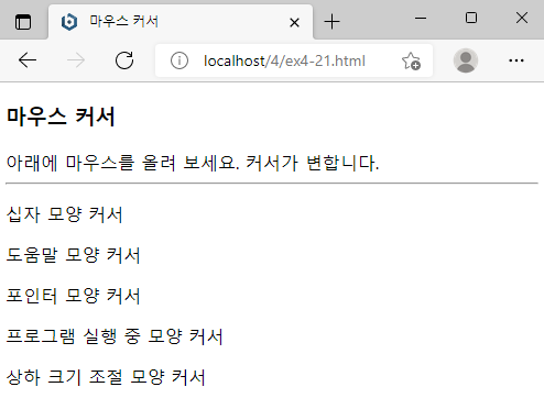
3. 마우스 커서 제어 : cursor
cursor : value

- value : 마우스 커서 모양을 나타내는 값 (ex: auto, crosshair, default, pointer, move, copy,
			help, progress, text, wait, none, zoom-in, zoom-out, e-resize, ne-resize,
            nw-resize, n-resize, se-resize, sw-resize, s-resize, w-resize, uri)
<!DOCTYPE html>
<html lang="en">
<head>
	<meta charset="UTF-8">
	<meta name="viewport" content="width=device-width, initial-scale=1.0">
	<title>마우스 커서</title>
</head>
<body>
	<h3>마우스 커서</h3>
	아래에 마우스를 올려 보세요. 커서가 변합니다.
	<hr>
	<p style="cursor: crosshair;">십자 모양 커서</p>
	<p style="cursor: help;">도움말 모양 커서</p>
	<p style="cursor: pointer;">포인터 모양 커서</p>
	<p style="cursor: progress;">프로그램 실행 중 모양 커서</p>
	<p style="cursor: n-resize">상하 크기 조절 모양 커서</p>
</body>
</html>